Apr 2019 - Jul 2021
Product Background
PrecisePK is a Bayesian-guided therapeutic drug monitoring software that helps pharmacists to provide individualized precision dosing and tailor it to each patient’s unique profile. It was originally developed by computer scientists and pharmacy professors as an academic research tool, and later it was commercialized as a desktop application. My role as a product designer was to revamp the product design, improve the user experience, and modernize the web application as a premium B2B healthcare SaaS enterprise software.
My Role / Contribution
Product Designer
• Coordinated all UX related efforts and led all research and design tasks
• Developed and implemented a scalable and flexible design system that revamped the product user interface and interaction design
• Cross-functionally collaborated with the development team, pharmacy expert team, and management team to create new product features and set strategic roadmaps.
Legacy Desktop Application (2019)
The PrecisePK desktop app had a legacy complex workflow with inconsistent UI. It was built with the academic mindset for expert/power users who are familiar with the concept of the system. It required extensive training prior to use and its usability problems and inconsistent design hindered the sales prospect of the software. Users found it difficult to understand, navigate, and use.
Measuring the Impact (2020)
Google Analytics data comparing monthly usage with 6 months before and after the product design improvements.
• Increased new users by 357%
• Increased user engagement rate by 342%
• Decreased bounce rate by 132%
• 80% of users voluntarily reported the software update to be "flexible, intuitive, and user-friendly"
• Increased user engagement rate by 342%
• Decreased bounce rate by 132%
• 80% of users voluntarily reported the software update to be "flexible, intuitive, and user-friendly"
Overall Design Process / My Approach
Gain Domain Knowledge
Read clinical pharmacy books, and internal documents visited hospitals, and talked to in-house pharmacists to gain insights.
Read clinical pharmacy books, and internal documents visited hospitals, and talked to in-house pharmacists to gain insights.
Conduct Rapid and Regular User Research
Conducted interviews, field studies, usability testings, and questionnaires to understand user goals, mental models, and workflows. I approached the project with flexibility, modularity, and holistic thinking and utilized an established user research protocol, design strategy, and iteration process to make product improvements with each sprint cycle.
Conducted interviews, field studies, usability testings, and questionnaires to understand user goals, mental models, and workflows. I approached the project with flexibility, modularity, and holistic thinking and utilized an established user research protocol, design strategy, and iteration process to make product improvements with each sprint cycle.
Map User Experience to Understand Product Opportunities
Conducted observation sessions to fill in the omitted or implied assumptions to complete the user journey mapping experience. Regular research has helped me uncover potential new opportunities and existing usability issues to tackle.
Conducted observation sessions to fill in the omitted or implied assumptions to complete the user journey mapping experience. Regular research has helped me uncover potential new opportunities and existing usability issues to tackle.
Integrate User Journey with Technical Development Process
Designed a brand new UI system, created new workflows, and interaction diagrams to synthesize process information, and worked closely with the development team to align product visions and goals with the roadmap.
Designed a brand new UI system, created new workflows, and interaction diagrams to synthesize process information, and worked closely with the development team to align product visions and goals with the roadmap.
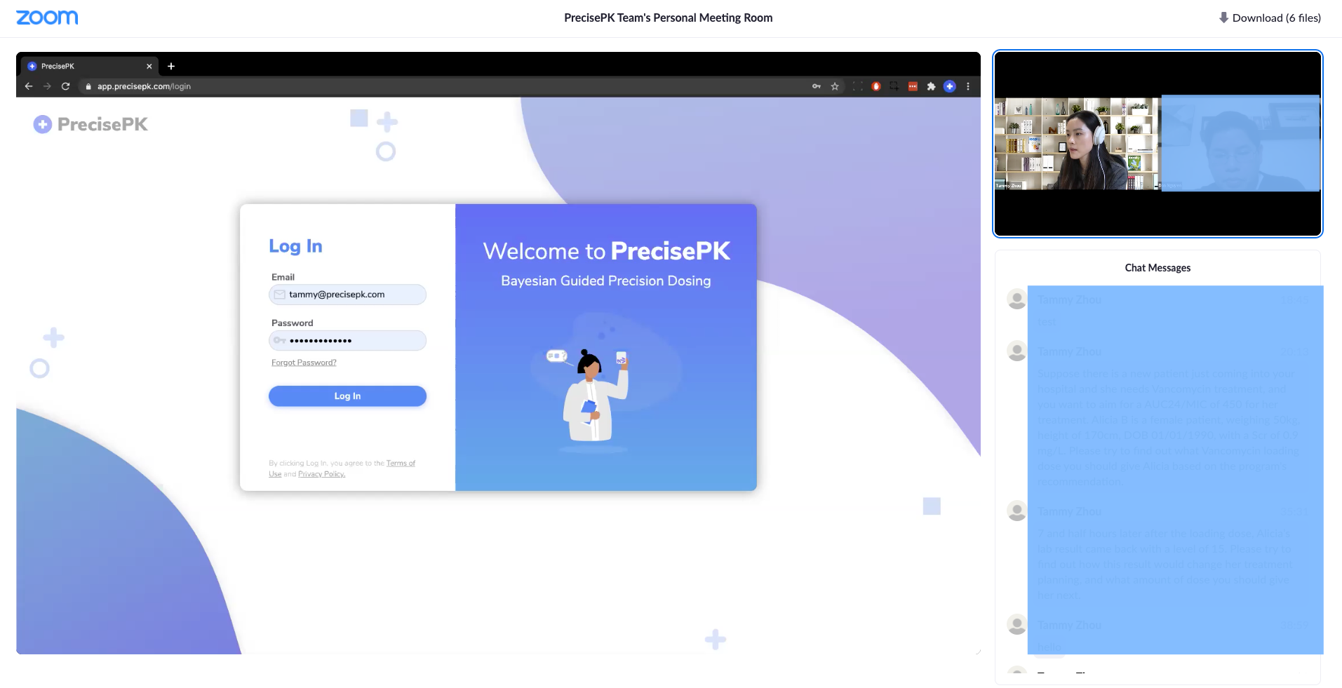
Conducting remote usability testing via Zoom (during COVID)
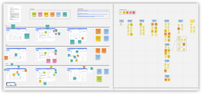
Snapshots of user research notes (using Miro)

Understanding the bigger picture and the problem scope from 3 different perspectives
(source: IDEO)
Unique Challenges
Extensive and specialized domain knowledge is required. Clinical software has complex structures with a large amount of data and idiosyncratic medical terminologies and jargon which I had no prior knowledge or experience of.
Extremely complicated clinical workflows and functional complexity. Designing complex features and functionalities to aid user goals while keeping users abreast of its technologies to fill in their knowledge gap was also a new challenge for me. I needed to find a fine balance between the huge data volume and the clean intuitive design while not surprising or disrupting any user's mental model.
End users are often not decision-makers. Designing for a B2B enterprise-level software, I needed to align product values with users’ needs and connect UX with customer success and business ROI.
Existing healthcare systems, including Electronic Medical Record systems (EHR/EMR) are outdated and not designed for today’s digital market. It was challenging to extract key information from a huge amount of messy data and lay them out in a compact, meaningful and intuitive way.
Understand and Define the Level of Complexity
Institution
Hospitals, clinics, teaching universities, research institutions.
Hospitals, clinics, teaching universities, research institutions.
Environment
Pharmacy team collaboration and coordination, users with shift work schedules and frequent interruptions, mobile workstations, distractions, long work hours, and breaks in the workflow.
Pharmacy team collaboration and coordination, users with shift work schedules and frequent interruptions, mobile workstations, distractions, long work hours, and breaks in the workflow.
Intention
Support unstructured user goals and flexible workflows, aid user’s decision making in determining the optimal regimen, admin users review reports and work performances, support education on latest industry guidelines.
Support unstructured user goals and flexible workflows, aid user’s decision making in determining the optimal regimen, admin users review reports and work performances, support education on latest industry guidelines.
Information
Data volume, presentation, and analysis of large data sets of
healthcare data - HIPPA privacy, large data volume, compact & concise layout design.
Data volume, presentation, and analysis of large data sets of
healthcare data - HIPPA privacy, large data volume, compact & concise layout design.
Integration
Electronic healthcare systems (EMR), other clinical surveillance solutions.
Electronic healthcare systems (EMR), other clinical surveillance solutions.
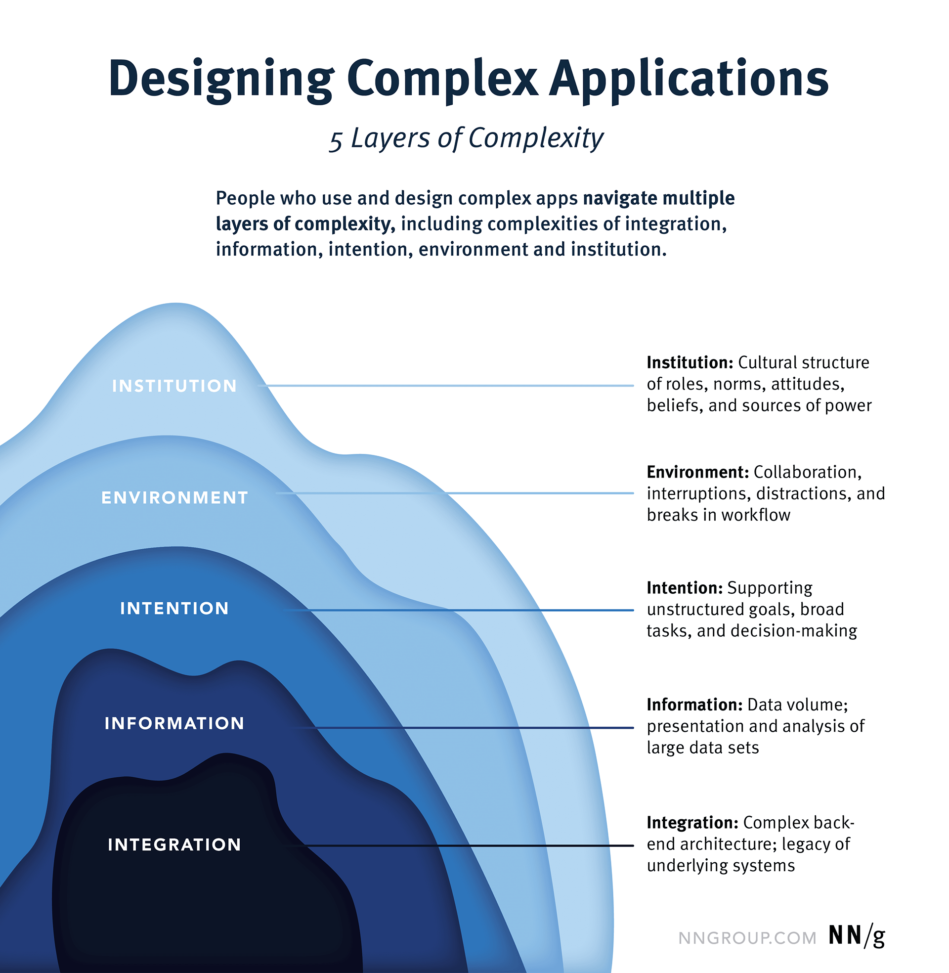
source: nngroup.com
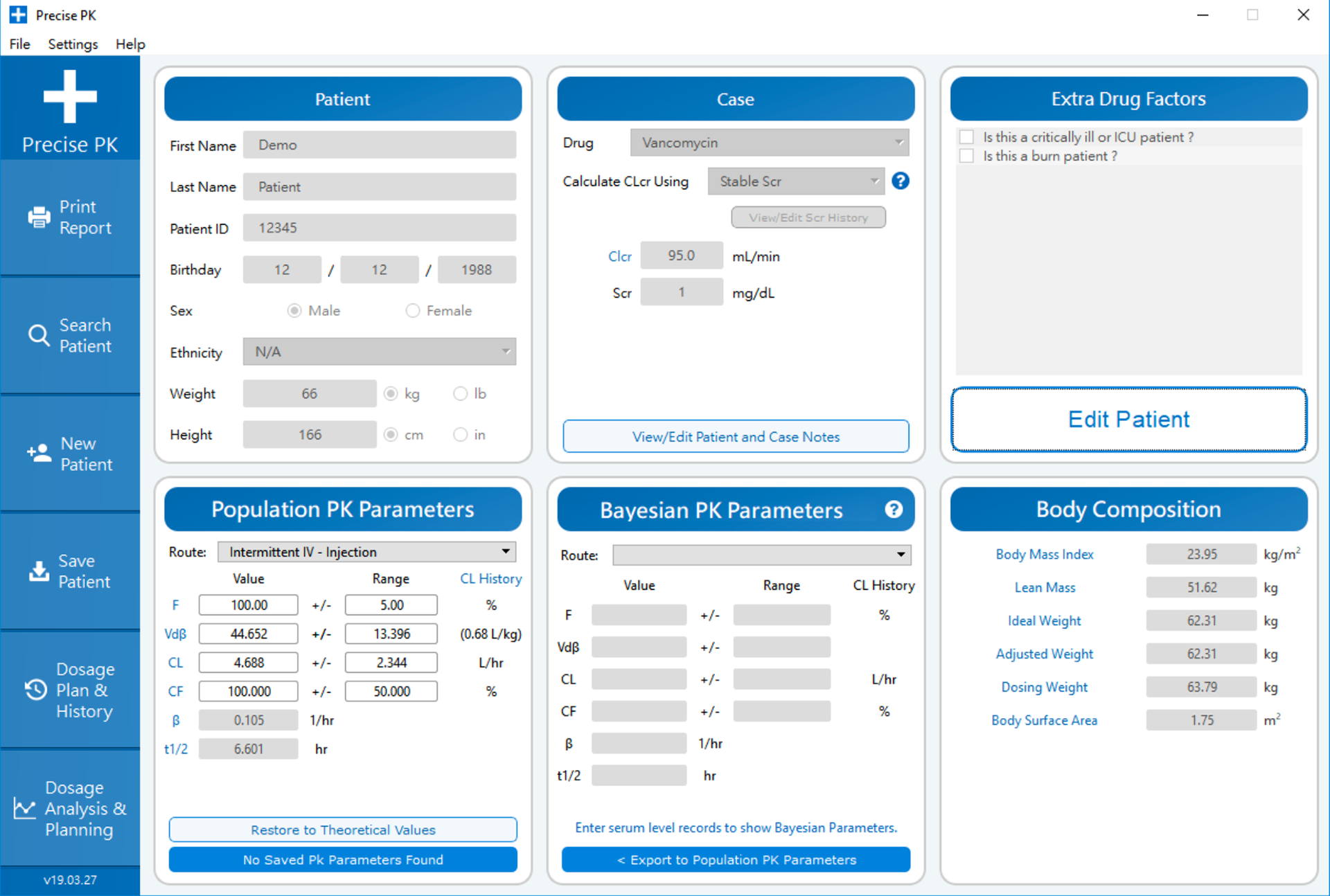
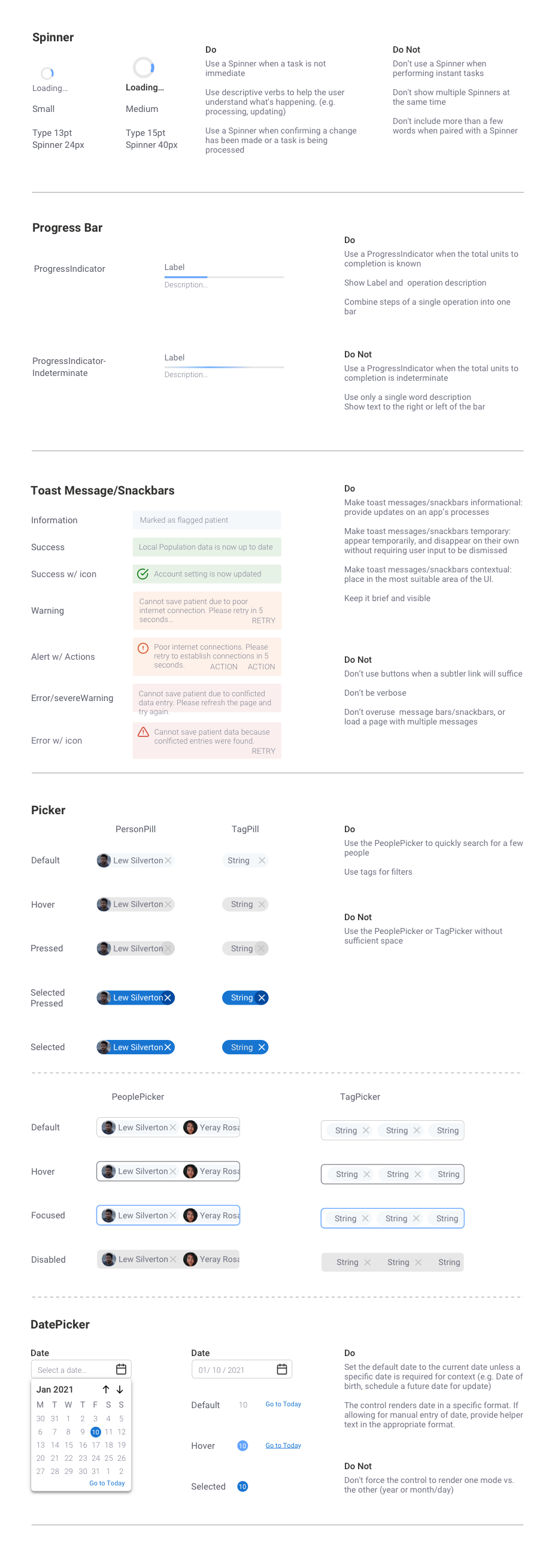
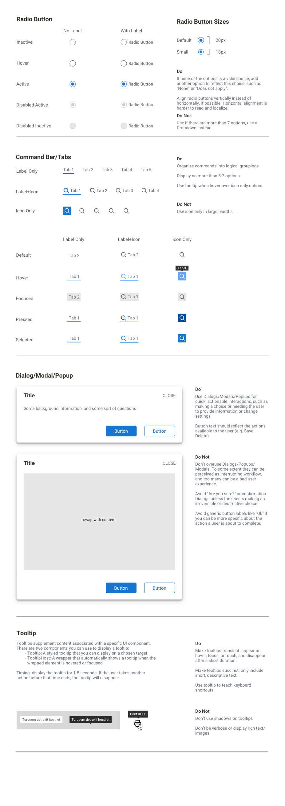
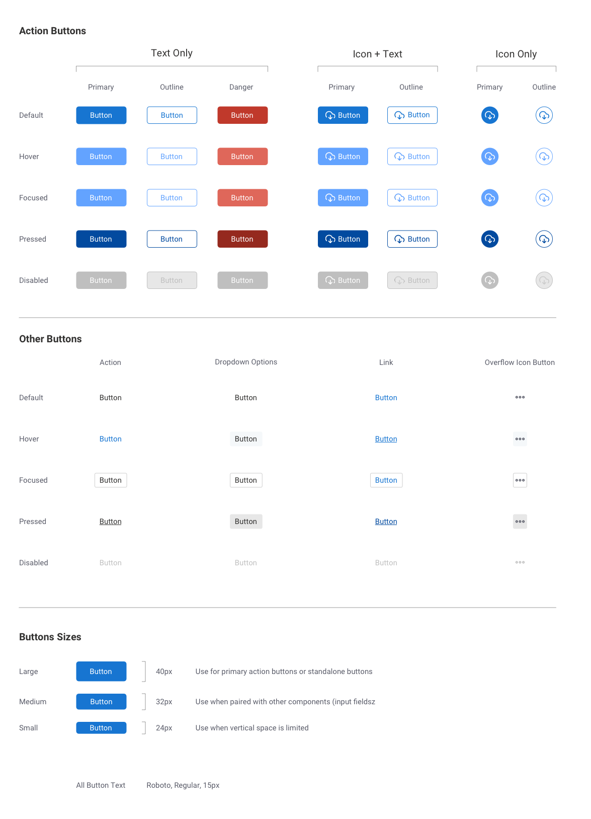
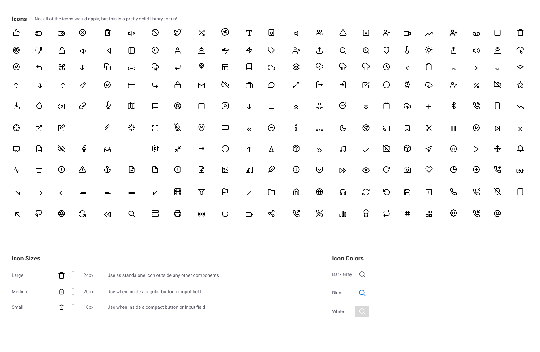
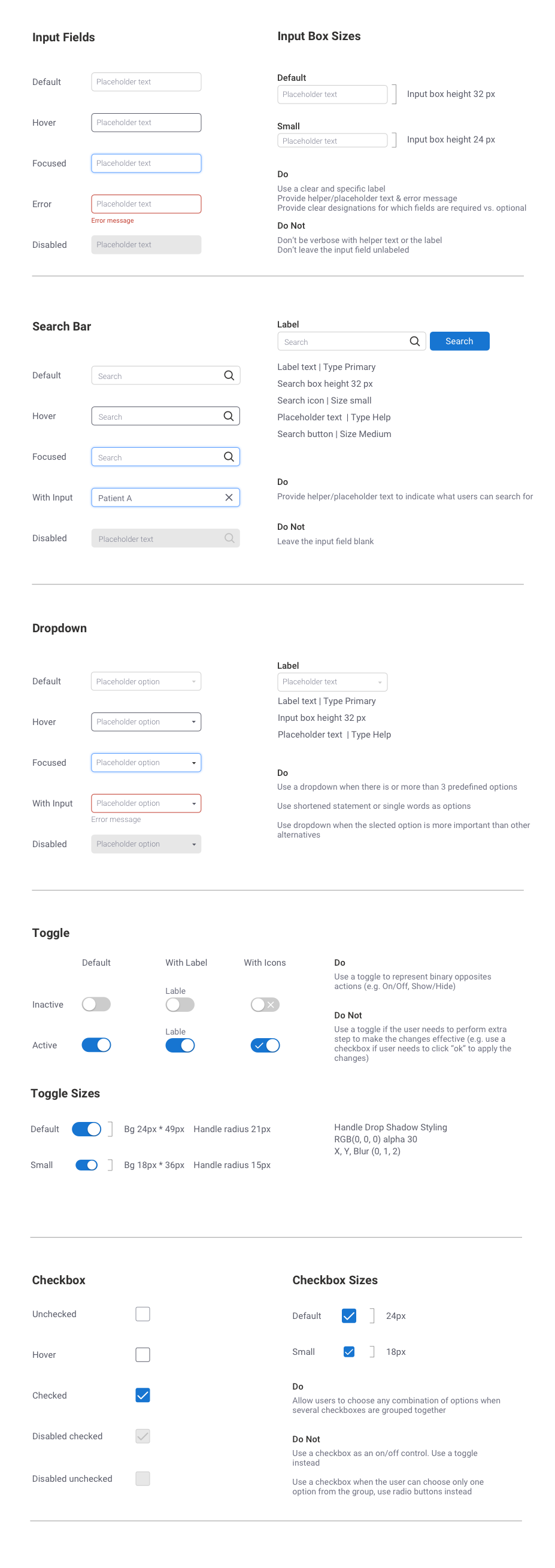
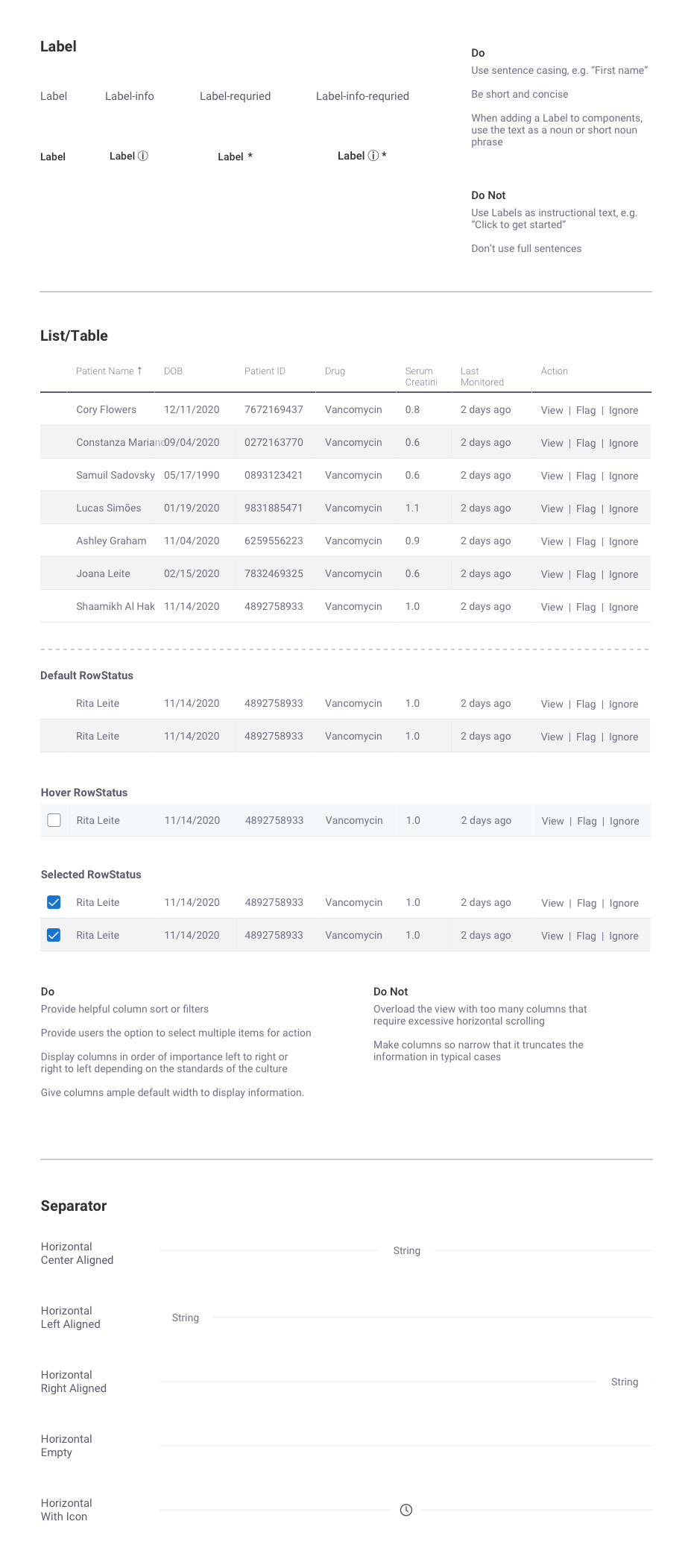
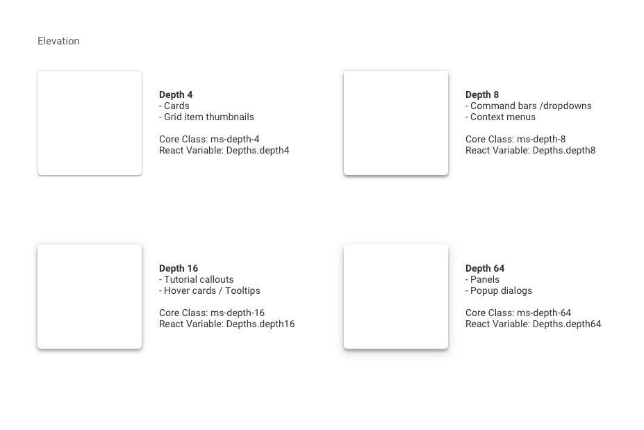
Creating the Design System
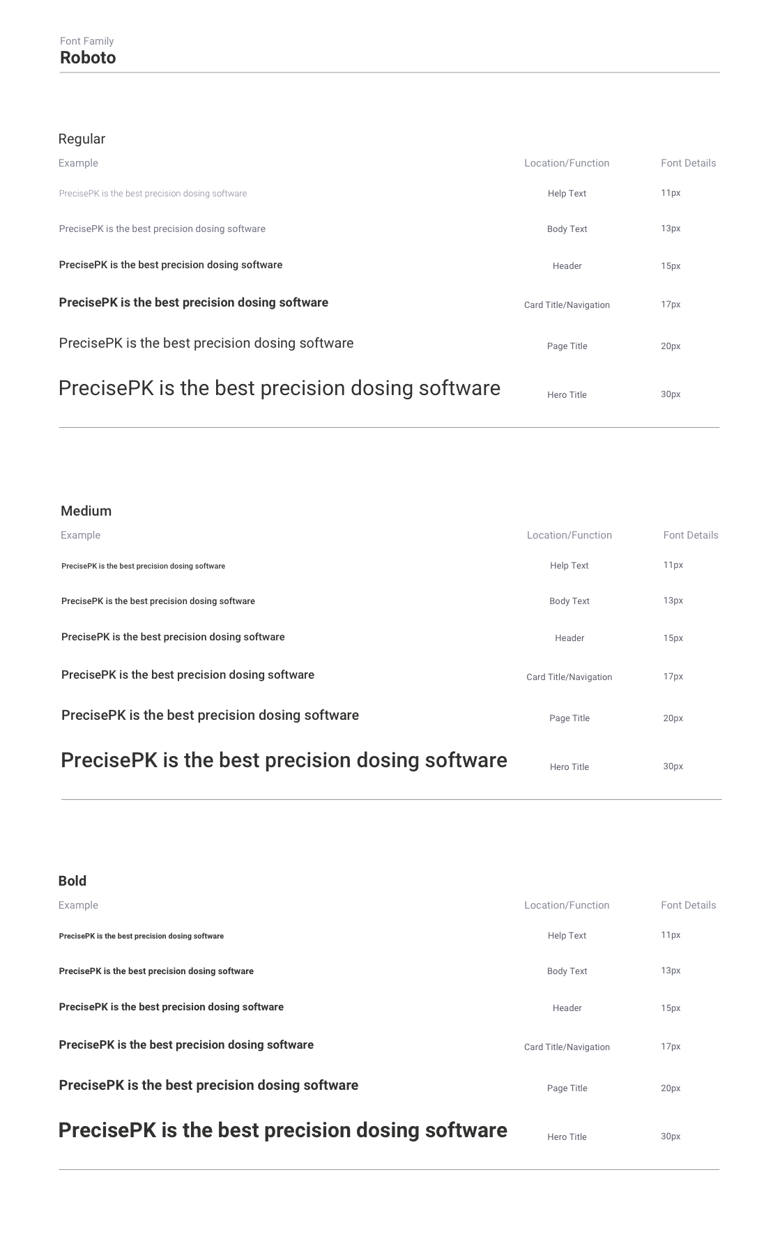
typography
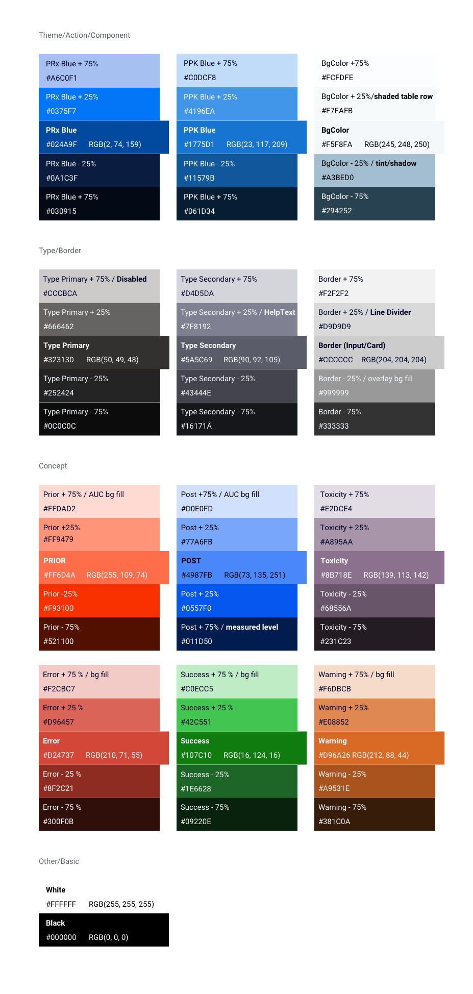
color theme
Web Application v2.1 (Mid-2021)
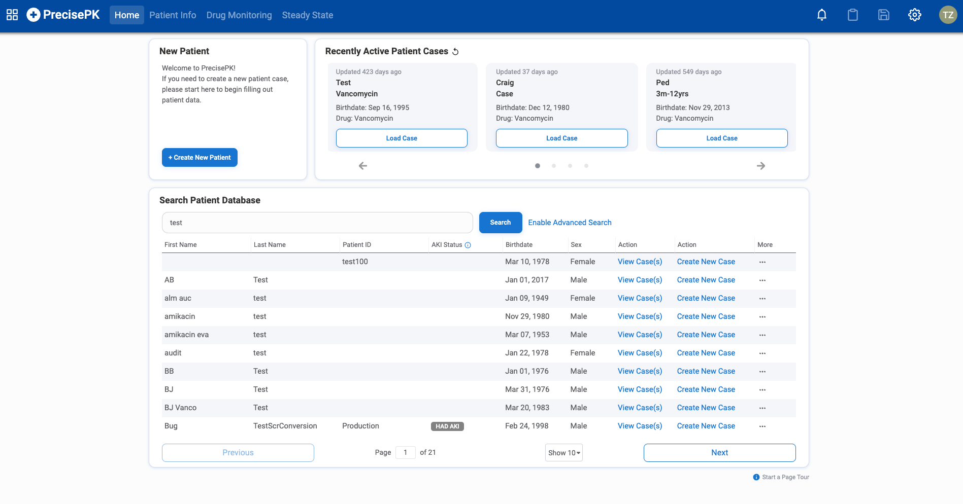

Key Design Changes
• Revamped the UI using the new design system for a more modern and cleaner look and feel
• Reduced interface clutter without reducing capabilities
• Provided flexible and fluid pathways through integrated workflows
• Reorganized information architecture using progressive disclosure
• Created new features with key insights that help clinicians with decision-making
• Added onboarding, product tours, and literature references throughout the application
Case Study
Balancing between Power and Simplicity
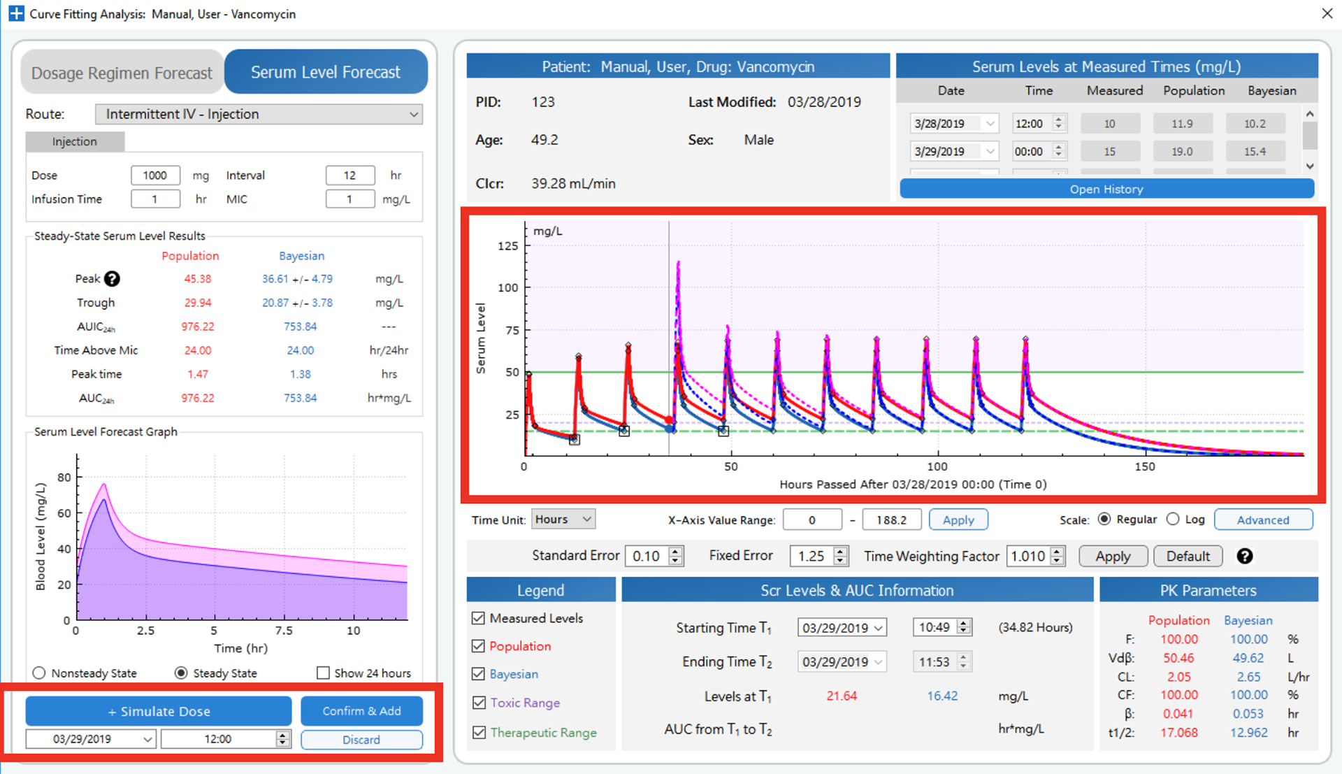
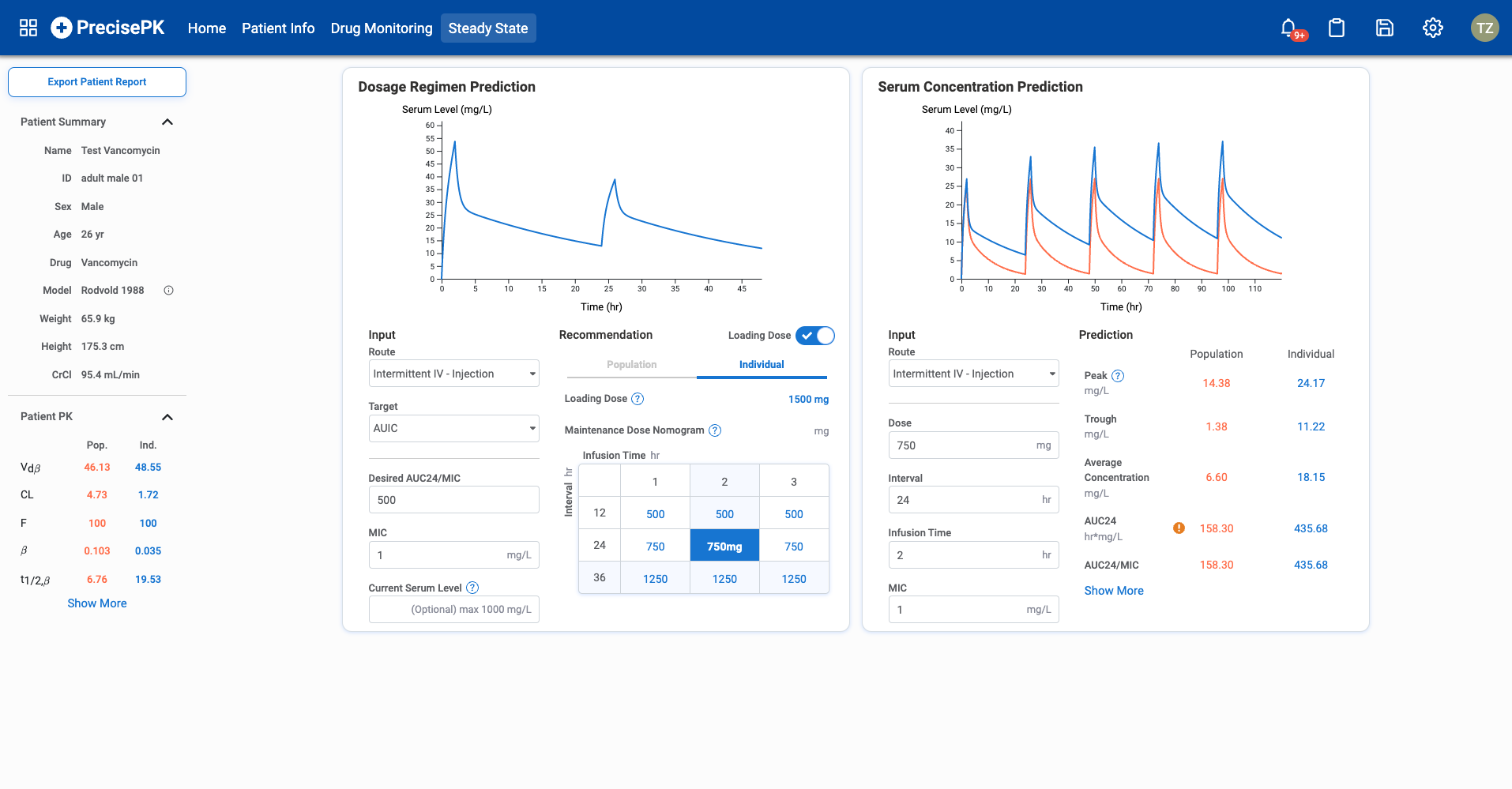
Clinicians look at a set of pharmacokinetic parameters (PK) to help them translate and understand how a drug interacts with the body. Depending on the drug, it can have 5 or 30 different parameters. However, in practice, only a handful of parameters is crucial to decision-making when it comes to dosing regimen calculation.
Clinicians look at a set of pharmacokinetic parameters (PK) to help them translate and understand how a drug interacts with the body. Depending on the drug, it can have 5 or 30 different parameters. However, in practice, only a handful of parameters is crucial to decision-making when it comes to dosing regimen calculation.
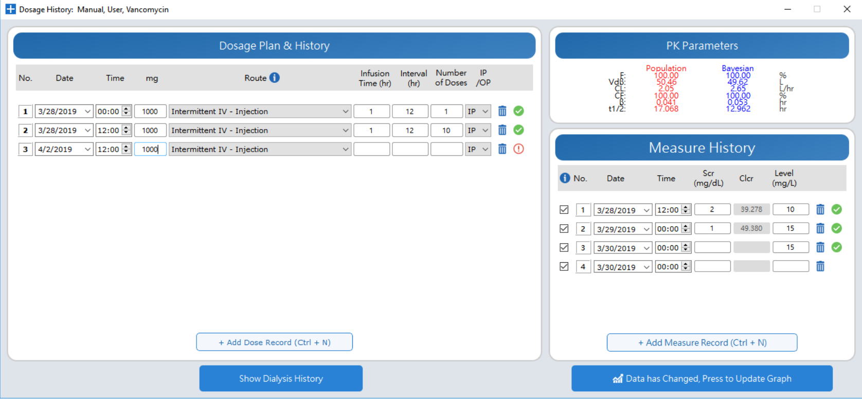
In the original version, every single PK parameter, both population and individual, was listed out on the screen. After talking to different groups of pharmacists, I learned that while it satisfied power users (e.g. director of pharmacy) who wanted full information transparency to trust the software, it causes confusion, was error-prone and cluttered the screen space for the regular novice users (e.g. pharmacy residents, ID pharmacists).
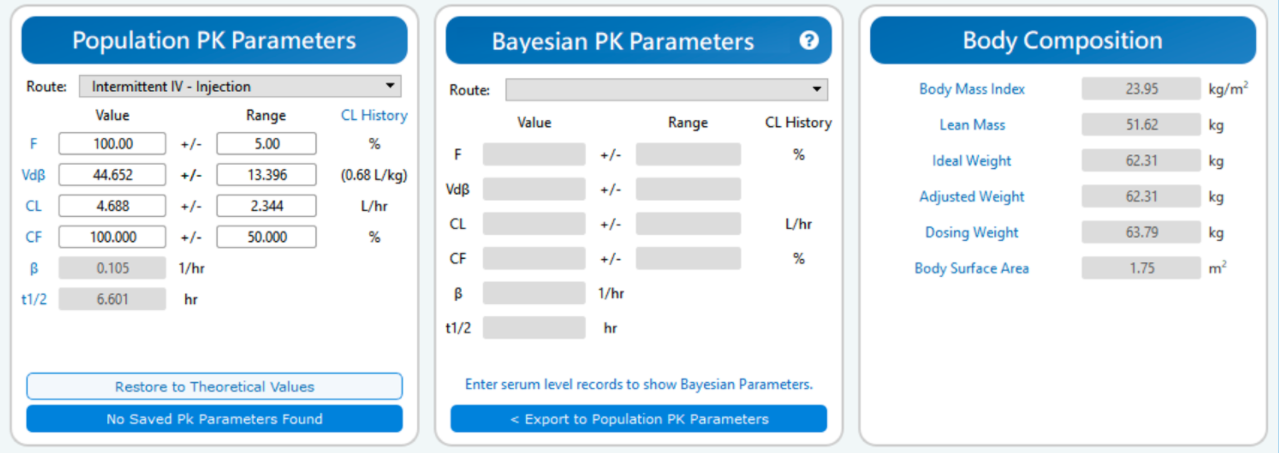
Old version displays all available PK information
To solve this problem, I used progressive disclosure to help regular voice users prioritize their attention so they only spend time on the most important information that might actually help them.
For advanced users, I provided the option to expand the card to see the entire list of parameters, and the clean initial display also saves them time because they avoid having to scan past a large list.
There is also a function option that links to sources and formulas for each parameter so that users can get the educational component as well.
Overall, this redesign improved learnability, efficiency of use, and error rate.
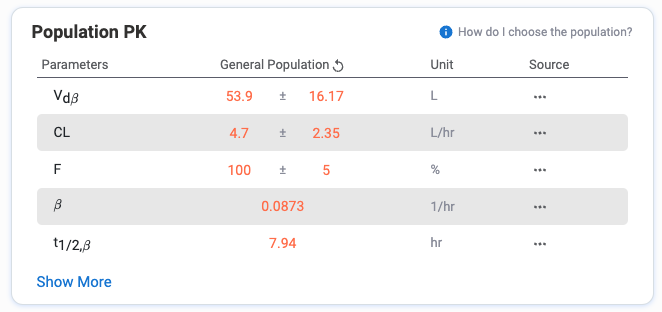
default view
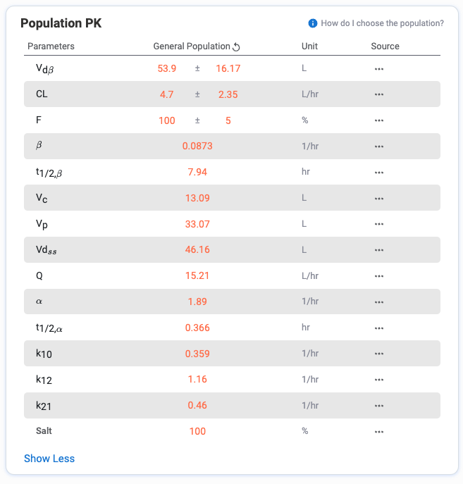
expanded view
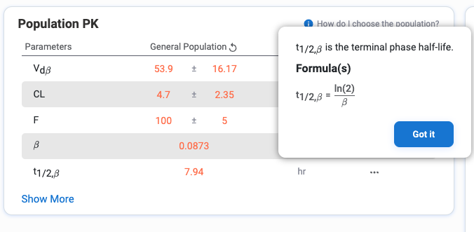
expand on PK parameter sources
Takeaway Thoughts
Designing for this B2B healthcare product provided me with the opportunity to make sense of incredibly complex problems (systematic thinking) while learning from healthcare professionals who often struggle with complex workflows (empathic thinking) and are subject to a multitude of touchpoints in the course of the user experience of the application (design for the product, user experience, interactions, etc).
Product Design in healthcare is a challenging yet satisfying job! I love diving deep into research to gain insights about the industry and product users, and solving multi-latitude complex issues for them. The Healthcare industry has a huge social impact, and it made me smile to hear how my product eased a user's day and helped them tremendously in their everyday practice.
Design constantly evolves within new sets of goals and constraints. There will always be new problems to solve, new workflows to improve, and new ideas to explore. I love this iterative process and constantly challenge myself to build better a product for the users and the business.
Aligning users' goals and business goals is a dynamic process. This helped me realize the weight of my job - advocating for the users within the business and helping the business bring more value to the users. The bridging role of product design is super empowering and exciting!