November - December 2021
Project Background
Farmbox is an alternative to centralized food growing systems in chain grocery stores. With local farmers, you also receive more varieties of seasonal fresh produce. Instead of buying produce that is transported from other parts of the country, buying produce from a local farmer can decrease carbon footprint. Also, buying produce from farm share boxes can support local organic farmers, to create a healthy circular economy and relationship.
Before the user research, I foresee a number of pain points in this problem space. In comparison to other food delivery services such as Ubereats or Amazon Fresh, farm box lacks in its flexibility to customization, responsiveness to multi-users, and ability to track orders. With these initial thoughts in mind, we want to create a farm box purchasing experience like no others.
My Role & Contribution
Product Designerdefined product specifications based on user research insights, designed prototypes at various fidelity, translated requirements into practical and desirable product features.
User Research
Our team conducted guerrilla-style user research and conducted interviews and directed storytelling with participants who have experience using grocery delivery services. 
After interviewing some customers of potential competitors of CROPBOX, we created a combined customer journey map to assess how to improve already existing models. We identified and broke down the general service model from like competitors into 5 phases —awareness, exploration/consideration, point-of-sale, delivery/pick-up, and post-purchase. 
We also focused on the phases where there were diverging branches in customer satisfaction.
Research Insights
Inconsistent Quality of Deliveries - Research suggests users’ satisfaction with the services was heavily dependent on the delivery/pick-up process.
Hard to Place Orders as a Household - Users found it particularly challenging to find time to meet
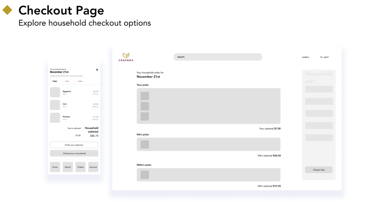
as a household to pick their groceries together.
Too Much Produce/Food to Consume - Users did not have a proper idea of how many units of items they will get or the quantity.
Hidden Fees Upset Customers - A lot of our participants expressed dissatisfaction with
hidden fees like premiums, services, and delivery fees.
Design Decisions
From the research findings, our team was able to discover which aspect of the service we could improve on and come up with a design solution that all of the stakeholders could potentially benefit from. The three key design decisions informed by the research insights are the “Checkout as a household” feature, “Keep browsing” section, and Delivery Tracking and Communication system.

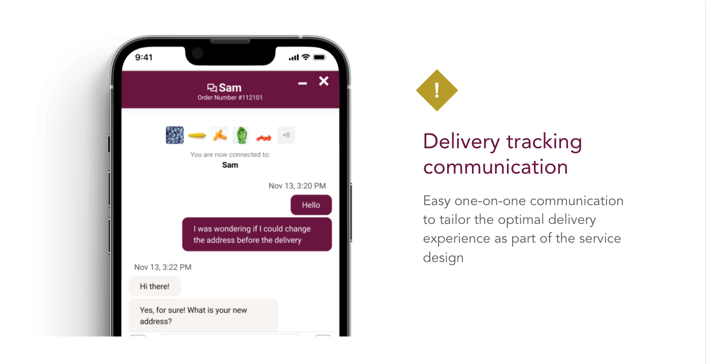
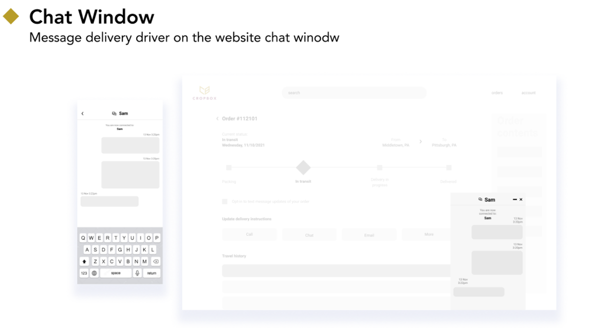
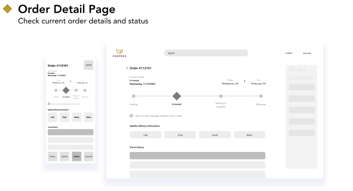
The tracking and communication system provides a more flexible delivery time window and tailors the optimal delivery experience for customers, who then can expect to enjoy the produce in their best condition.

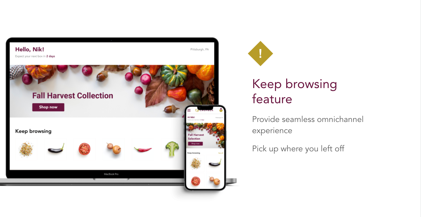
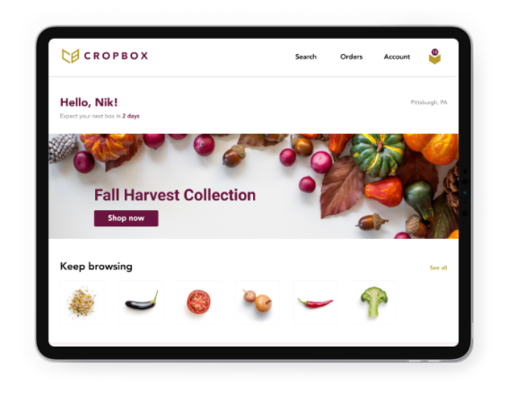
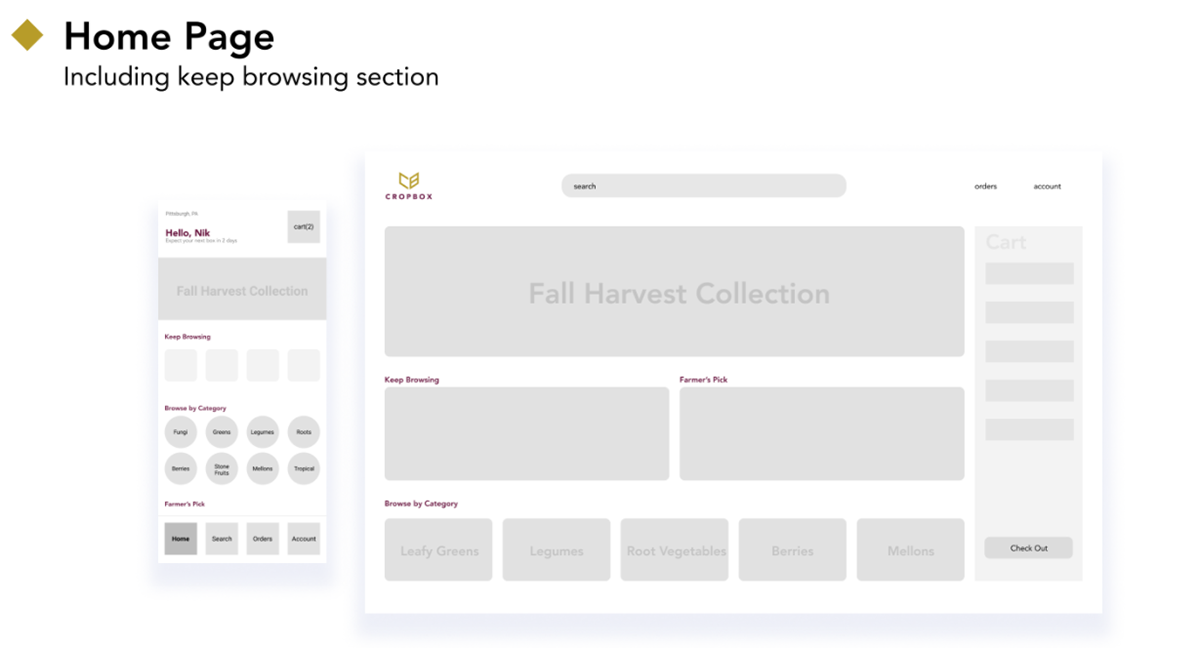
Given the responsive web platform, having the “Keep Browsing” section provides a seamless omnichannel experience to the users across devices of different screen sizes.

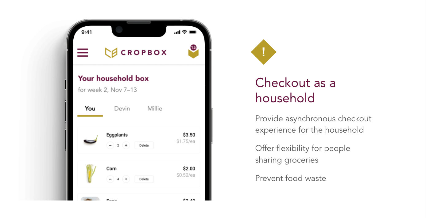
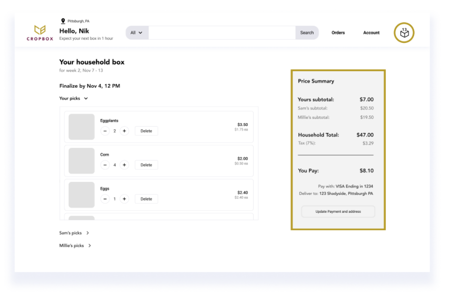
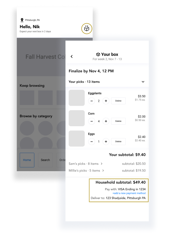
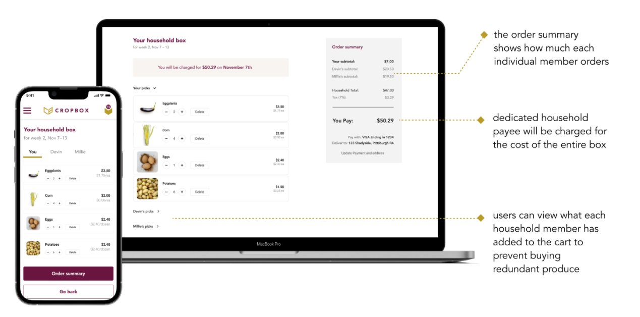
The "checkout as a household" feature allows individual customers to make their own selections for the shared box asynchronously while being able to see what other people in the house chose for their produce. This would not only help them reduce food waste by avoiding purchasing redundant items but also alleviate any stress of having to congregate in front of a bigger screen to make a collective decision on their order.

Low-Fi Prototype
Paper Prototyping (Mobile)
After finishing the low-fi design, we created paper prototypes to test out the following key user tasks and gain feedback.
Mid-Fi Prototype
One of the feedback we received from user testing was the location of the cart icon on the mobile is different from their expectation. The user was looking for a cart icon on the top right corner of the screen in their mental model. We did more research on similar design patterns and decided to
incorporate their feedback in this iteration. 
We also received critiques when users were confused between the two buttons “checkout as a household” and “finish your selection”. One user thought clicking on the “finish your selection” button would direct them to another page while another was concerned about what would happen if two people in the same household would click on the “checkout as a household” button at the same time. 
As a team, we reflected on what subscription service design means and how it could be improved to help both end-users and service providers. We decided to remove those two buttons and instead dedicate one person as the household payee who will be charged for the cost of the entire box.
High-Fi Prototype
Measuring Success
In order to fully evaluate the effectiveness of our design, we divided up the success criteria into three different categories that measure system performance, user overall satisfaction, and user’s willingness to pay. 
Net Promoter Score -  a strong indicator for our overall design solutions
Active Monthly Subscribers to CROPBOX -  a universal indicator of how big our audience is. It can also reflect our product’s penetration rate in the intended audience group. 
Price Milestone for Household -  for other farm share boxes, they come in preset sizes for users to select. Our design is different and we offer more flexibility, so measuring average household price is critical to measuring our success. 

Next Steps
Going forward, we wish to continue to explore and refine our solution for CROPBOX.
 • Add tablet mobile UI 
 • Explore pay as household/individual options
 • More user testings and iterations
Thanks to Our Team

More of My Works

Back to Top