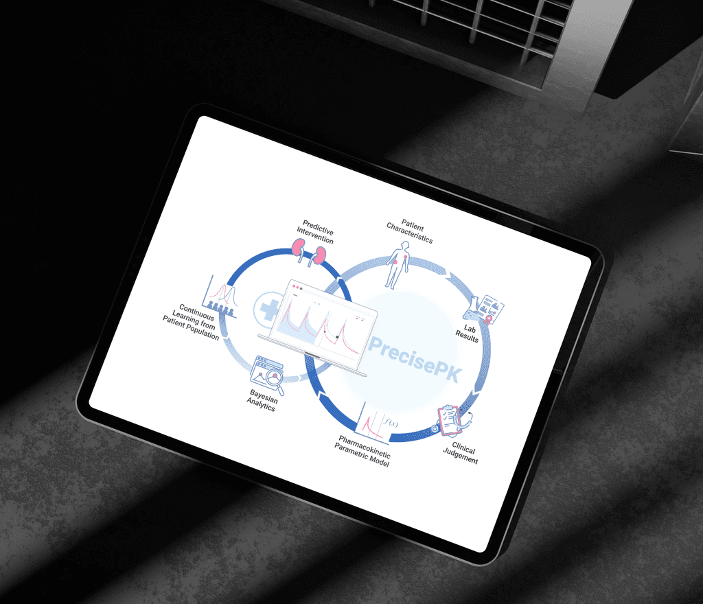
PrecisePK
founding designer. redesigned a clinical dosing tool from legacy desktop to modern web app, improved learnability, reduced errors, and drove 3x user growth
00
problem
A clinical dosing tool built by academics, not designed for the pharmacists using it daily. Dense screens showed all data at once with no hierarchy, forcing clinicians to parse large amount of data when only a few mattered. Inconsistent interaction patterns made the product hard to learn, slow to use, and error-prone in high-stakes dosing decisions.
solution
Redesigned the information architecture around progressive disclosure, surfacing what clinicians need most and letting them drill deeper on demand. Built a scalable design system that unified interaction patterns across the product. Added research-driven features like inline references, flexible workflows, and onboarding cues to reduce cognitive load and support decision-making in context.
my role
founding product designer
industry
Healthcare
timeframe
Apr 2019 - Jul 2021
outcome snapshot
(after 6 months) +357% new users +342% engagement −132% bounce rate 80% +users report flexible, intuitive, user-friendly
project snapshot
I joined as the sole product designer on PrecisePK, a clinical dosing tool used by hospital pharmacists to personalize drug therapy for patients. The product started as an academic research tool built by computer scientists and pharmacy professors, functional but not designed for the pharmacists who used it daily. It was being commercialized as a B2B SaaS product, and the experience needed to catch up: a legacy desktop app with steep learning curves, dense interfaces, and workflows that didn't match how clinicians actually worked. I owned research, strategy, and design end-to-end, from building domain expertise in clinical pharmacokinetics to shipping a redesigned web application and design system that made the product learnable, efficient, and safer to use.
research & discovery
Clinical pharmacokinetics was new territory for me. I took ownership of ramping up quickly — reading PK textbooks and internal documentation, visiting hospitals to observe pharmacists during rounds, and building ongoing relationships with our in-house pharmacy experts. Within weeks I could follow clinical conversations, ask sharper questions, and spot design assumptions that others missed.
I established a continuous research program (user interviews, field studies, observation sessions, usability tests, and surveys), and built a consistent protocol so findings fed directly into each sprint. No one asked me to set this up; I saw the gap and made it happen. This gave the team a regular cadence of user insight instead of designing on assumptions.
These research surfaced a critical product insight:
Our product served two user types with fundamentally different needs.
Power users (e.g., directors of pharmacy) wanted full transparency into PK parameters to trust the software. Regular users (e.g., pharmacy residents, ID pharmacists) only cared about the few parameters relevant to dosing decisions, and the rest was noise that increased cognitive load and error risk. The same interface had to work for both without compromising either experience.
This insight reframed the problem from a UI cleanup into a structural redesign, baking in progressive disclosure as the core strategy, and gave me a clear case to bring to leadership and engineering for prioritization.
case study: balancing power and simplicity
The PK parameters screen was the highest-impact redesign opportunity.
Depending on the drug, clinicians see 5–30 parameters, but only a handful drive dosing decisions. The original screen showed everything at once — no hierarchy, no prioritization.
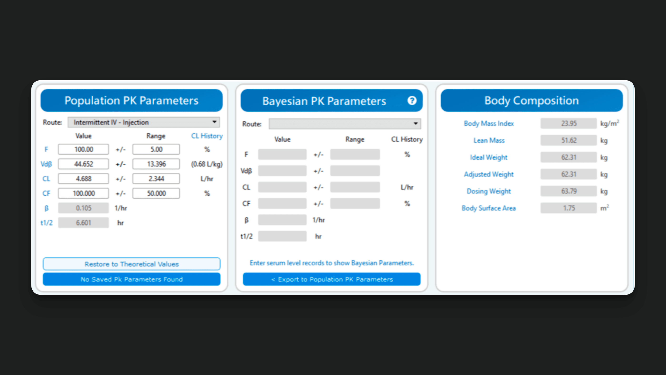
I explored several approaches before landing on progressive disclosure. A tabbed layout separated the two user types too rigidly and broke the workflow for users who needed to cross-reference. A filtered view required users to know what to filter for, which defeated the purpose for less experienced clinicians. Progressive disclosure let me keep one shared interface while defaulting to what matters most — regular users see the key parameters upfront, and power users expand a card to access the full list on demand.
I also added inline links to sources and formulas for each parameter. This came directly from observation sessions where residents would leave the product to look up references. Keeping that context in-product reduced interruptions and supported learning on the job.
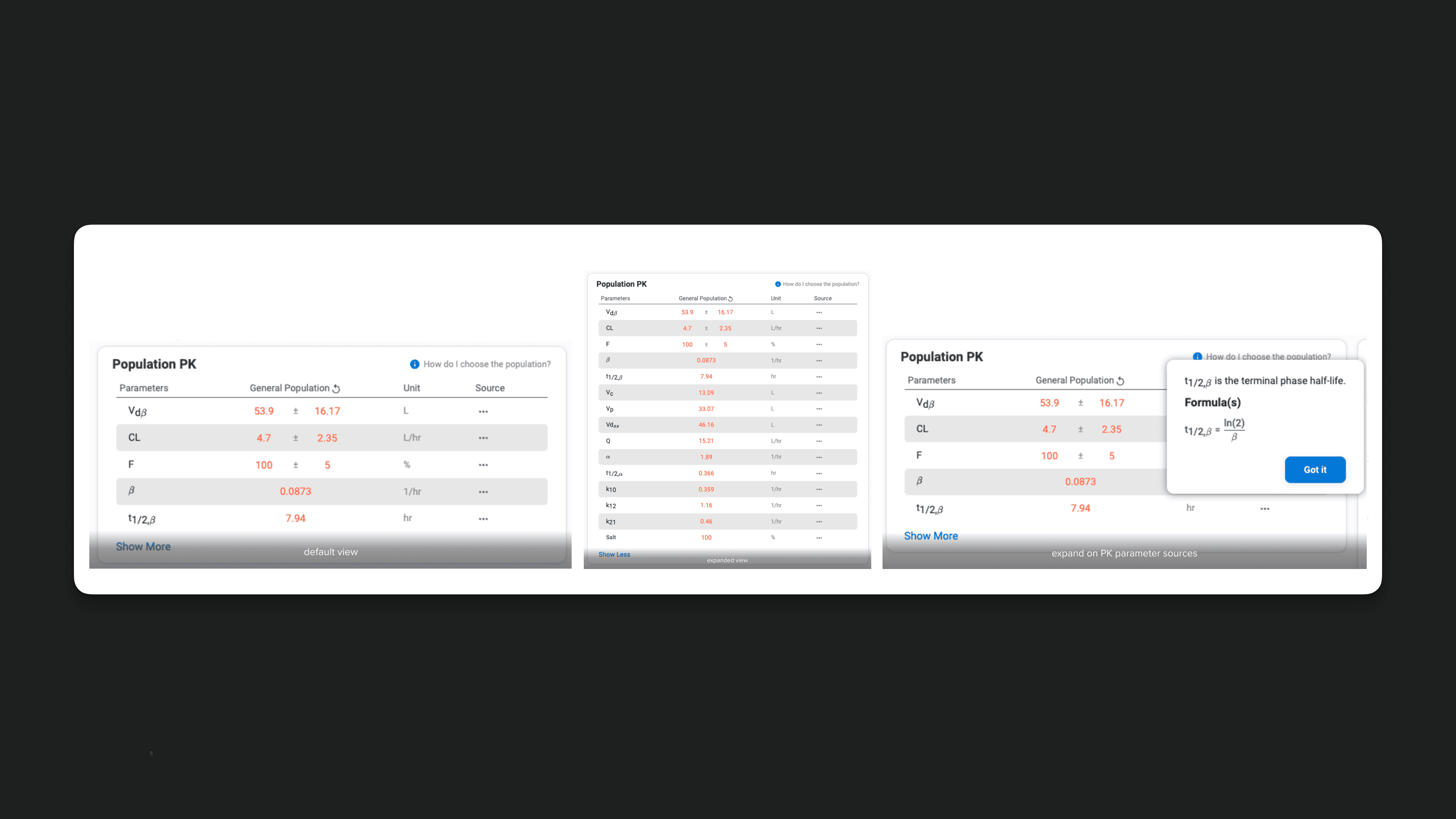
The redesign improved learnability, efficiency, and error rate across both user types. The cleaner default view saved power users scanning time too, an outcome I hadn't anticipated but validated in follow-up testing.
design works samples
01

02

03

04
takeaway thoughts
Designing for this B2B healthcare product provided me with the opportunity to make sense of incredibly complex problems (systematic thinking) while learning from healthcare professionals who often struggle with complex workflows (empathic thinking) and are subject to a multitude of touchpoints in the course of the user experience of the application (design for the product, user experience, interactions, etc).
Product Design in healthcare is a challenging yet satisfying job! I love diving deep into research to gain insights about the industry and product users, and solving multi-latitude complex issues for them. The Healthcare industry has a huge social impact, and it made me smile to hear how my product eased a user's day and helped them tremendously in their everyday practice.
Design constantly evolves within new sets of goals and constraints. There will always be new problems to solve, new workflows to improve, and new ideas to explore. I love this iterative process and constantly challenge myself to build better a product for the users and the business.
Aligning users' goals and business goals is a dynamic process. This helped me realize the weight of my job - advocating for the users within the business and helping the business bring more value to the users. The bridging role of product design is super empowering and exciting!